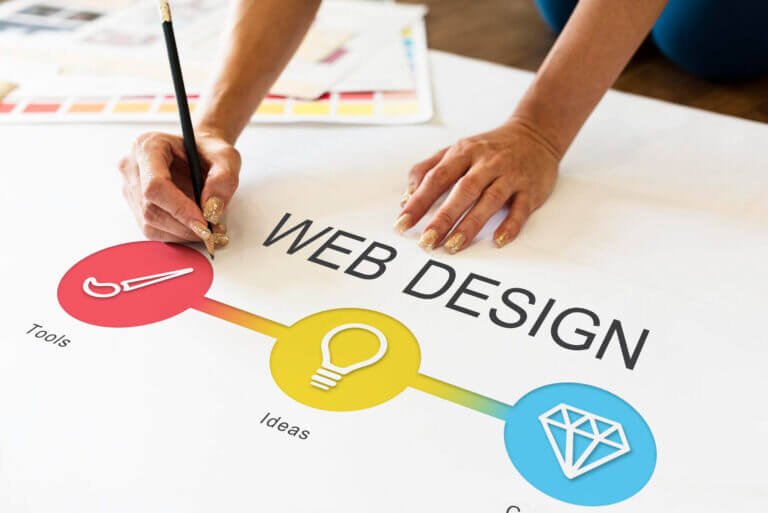
Your website is often the first point of contact between your brand and potential customers. At MHB, we understand that an effective website is more than just a pretty face—it’s a powerful tool that blends aesthetics with functionality to create maximum impact. As a digital web design agency specializing in branding and website design, we’re passionate about creating visually stunning and highly functional websites that drive business growth. Let’s explore the key principles that guide our approach to impactful web design.
- 1. Understanding User-Centered Design
- 2. Visual Hierarchy and Layout
- 3. Colour Theory and Typography in Web Design
- 4. Responsive Design and Mobile-First Approach
- 5. Navigation and Information Architecture
- 6. Content Strategy and Presentation
- 7. Performance Optimization
- 8. Accessibility in Web Design
- 9. Integrating Branding into Web Design
- 10. Interactive Elements and Micro-interactions
- 11. Testing and Iteration
- 12. MHB’s Approach to Impactful Web Design
- 13. Future Trends in Web Design
- 14. Conclusion: Crafting Websites That Make an Impact
Understanding User-Centered Design
At the heart of effective web design lies a deep understanding of the user. User-centered design is one of the core website design principles about creating experiences that resonate with your target audience:
- Conduct thorough user research to understand your audience’s needs, preferences, and pain points.
- Develop user personas to guide design decisions and ensure your website speaks directly to your ideal customers.
- Design with user goals in mind, making it easy for visitors to accomplish what they came to your site to do.
By putting the user first, we create websites that not only look great but also deliver real value.

Visual Hierarchy and Layout
A well-structured layout guides users through your content effortlessly:
- Implement a clear visual hierarchy to highlight important elements and guide user attention.
- Use whitespace effectively to create a clean, uncluttered design that’s easy to navigate.
- Employ grid systems to create organized, balanced layouts that adapt well to different screen sizes.
- Consider F-pattern and Z-pattern layouts to align with natural eye-scanning patterns.
Colour Theory and Typography in Web Design
Colours and fonts play a crucial role in conveying your brand personality and enhancing usability:
- Choose a colour palette that aligns with your brand identity and evokes the right emotions.
- Understand colour psychology to influence user behaviour and create desired associations.
- Select fonts that are not only on-brand but also highly readable across devices.
- Implement typographic hierarchy to structure content and improve scannability.
Responsive Design and Mobile-First Approach
In today’s mobile-driven world, responsive design is non-negotiable:
- Adopt a mobile-first strategy, designing for smaller screens first and then scaling up.
- Use fluid grids and flexible images to ensure your design adapts seamlessly to any screen size.
- Create touch-friendly interfaces with appropriately sized and spaced interactive elements.
- Test your design across a variety of devices to ensure consistent experiences.
Intuitive navigation is key to keeping users engaged and helping them find what they need:
- Create clear, logical navigation structures that reflect your content hierarchy.
- Use descriptive labels that make it immediately clear what users will find in each section.
- Implement effective search functionality for larger sites with extensive content.
- Organize your content in a way that makes sense to your users, not just your internal structure.

Content Strategy and Presentation
Great design should enhance, not overshadow, your content:
- Craft compelling, scannable content that delivers value to your users.
- Use visuals strategically to break up text and illustrate key points.
- Implement clear, action-oriented calls-to-action (CTAs) to guide users towards desired actions.
- Strike a balance between text and multimedia elements to create an engaging, informative experience.
Performance Optimization
A beautiful website is of little use if it’s slow to load:
- Optimize images and multimedia content to reduce file sizes without sacrificing quality.
- Minimize HTTP requests by consolidating files and using CSS sprites where appropriate.
- Leverage browser caching and content delivery networks (CDNs) to improve load times.
- Regularly test and optimize your site’s performance to ensure quick load times on all devices.
Accessibility in Web Design
Designing for accessibility ensures your website can be used by all:
- Follow WCAG guidelines to make your site accessible to users with disabilities.
- Implement keyboard navigation and ensure screen reader compatibility.
- Use sufficient color contrast and readable font sizes to accommodate users with visual impairments.
- Provide alternative text for images and captions for video content.

Integrating Branding into Web Design
Your website should be a seamless extension of your brand:
- Maintain consistent use of brand colors, fonts, and imagery throughout the site.
- Incorporate brand elements in creative ways that enhance the overall design.
- Create a unique user experience that reflects your brand personality and values.
Interactive Elements and Micro-interactions
Thoughtful interactions can significantly enhance user engagement:
- Implement subtle animations to provide feedback and guide user attention.
- Use micro-interactions to improve usability and add moments of delight.
- Ensure interactive elements are intuitive and provide clear visual feedback.
Testing and Iteration
Great web design is an ongoing process of refinement:
- Conduct user testing to gather real-world feedback on your design.
- Use A/B testing to optimize key design elements and improve conversions.
- Continuously analyze user data and make data-driven design decisions.
- Be willing to iterate and improve your design based on user feedback and behavior.
MHB’s Approach to Impactful Web Design
- Conducted extensive user research to understand customer pain points and preferences.
- Redesigned the site with a clean, modern aesthetic that aligned with the brand’s premium positioning.
- Implemented a mobile-first, responsive design to cater to the growing mobile user base.
- Streamlined the navigation and search functionality to help users find products more easily.
- Optimized site performance to significantly reduce load times.
Results:
- 50% reduction in bounce rate
- 75% increase in mobile conversions
- 40% improvement in overall user engagement metrics
- 60% boost in organic search traffic due to improved SEO performance
Key Takeaway: By blending form and function through thoughtful, user-centred design, we created a website that not only looked great but also delivered tangible business results.
Future Trends in Web Design
As we look to the future, several trends are shaping the evolution of web design:
- Increased use of AI and machine learning for personalized user experiences
- Integration of virtual and augmented reality elements in web interfaces
- Growing emphasis on voice user interfaces and conversational design
- Continued focus on accessibility and inclusive design practices
At MHB, our team of visionary and innovative individuals stays at the forefront of these trends, ensuring our clients’ websites are not just current, but future-ready.
Conclusion: Crafting Websites That Make an Impact
Effective website design is a delicate balance of form and function. By focusing on user needs, creating visually appealing layouts, ensuring responsiveness, optimizing performance, and continuously refining based on data and feedback, you can create a website that not only looks stunning but also drives real business results.

At MHB, our biggest asset is our people—visionary and innovative individuals who are passionate about taking businesses to the next level through expert web design and development. We understand that your website is more than just a digital brochure; it’s a powerful tool for growth, engagement, and brand building.
Ready to create a website that makes a lasting impact? Let’s collaborate and bring your digital vision to life. With MHB’s expertise in blending form and function, we’ll create a web presence that not only turns heads but also turns visitors into loyal customers. Your journey to digital excellence starts here!